It’s that time of the year again—major brands in the design world are releasing their predictions for the year’s top trending color. To keep all the information in one place, we’re rounding up all the announcements released for 2027. Check back frequently for updates!
Benjamin Moore: Webster Green

Benjamin Moore
Benjamin Moore debuted its choice for the 2027 color of the year—Webster Green HC-130, an adaptable shade that exudes classic confidence. The team at Benjamin Moore wanted to select a hue that felt fresh and right for today, recognizing that green has always been a steadfast presence across home interior design trends.
“For 2027, our focus centered on the green color family,” says Andrea Magno, vice president of brand, color, and integrated marketing at Benjamin Moore, in a prepared statement. “When we looked across the past, present, and future of color trends, variations on green consistently demonstrated remarkable staying power. Webster Green HC-130 reflects this timeless appeal by pairing reassuring stability with optimistic energy. Its composed nature feels both rooted and forward-looking, while enhancing spaces that feel distinctive, collected, and continually new.”
Webster Green HC-130 is joined by seven carefully curated hues that thoughtfully complement its quintessential personality:
- White Down OC-131: a cozy off-white
- Nelson Blue CW-635: a watery pale blue
- Shakespeare Tan 228: a golden neutral
- Antique Copper 1169: a sophisticated brown with warm undertones
- Wild Aster 1240: a graceful pink
- Durango 2137-30: an olive-rooted neutral
- Townsend Harbor Brown HC-64: a grounded burgundy
Sherwin-Williams & HGTV Home by Sherwin-Williams: Celery

Sherwin-Williams
Sherwin-Williams and HGTV Home by Sherwin-Williams together selected Celery as their 2027 color of the year, an airy green with subtle yellow undertones to evoke comfort and calm. Celery is part of Sherwin-Williams’ 2027 Colormix Trend Forecast, Rewild, available as Celery SW 6421 and as Celery HGSW6421 from HGTV Home.
“Celery was chosen as the 2027 color of the year because it reflects today’s priorities: wellness, balance, and connection,” says Ashley Banbury, color marketing manager at Sherwin-Williams. “Homeowners and designers are increasingly prioritizing wellness at home, seeking soothing environments that support mental health and overall well-being. That shift also fueled interest in eco-inspired design, with a greater emphasis on bringing elements of the natural world indoors through color, while a sustainability mindset is shaping preferences for hues that feel enduring.”
The other shades of Sherwin-Williams’ trend forecast palette include:
- White Flour SW 7102: a clean white with cream undertones
- Potentially Purple SW 6821: a playful soft purple
- Cosmos SW 6528: a dreamy blue with hints of violet undertones
- Georgian Bay SW 6509: a deep, cerulean-tinged blue
- Artichoke SW 6179: a cool, natural green
- Cocoon SW 6173: an earthy brown
- Woven Wicker SW 9104: a warm, golden brown
- Kirsch Red SW 6313: a darker, muted red
- Plum Brown SW 6272: a rich purple grounded in brown
The palette also includes a complementary Minwax stain, Pickled Oak MW 260, a semi-transparent stain in Minwax’s white color family.
Valspar: Cottage Door

Valspar
To create spaces that feel lived-in, familiar, and comfortable, Valspar chose Cottage Door 8004-38E as its 2027 color of the year, a mid-tone neutral blue that thoughtfully blends cool and warm undertones. The paint company has a major retail partnership with Lowes, which has locations throughout the Midwest.
“Cottage Door celebrates the unique beauty inside us all,” says Sue Kim, director of color marketing at Valspar. “This mid-tone neutral blue is reflective and warm, with timeless appeal that feels personal and grounding. Cottage Door captures blue’s natural sense of security and trust while serving as a colorful new neutral that layers effortlessly into the home. It creates spaces that feel balanced, comforting, and inviting.”
To complement Cottage Door’s grounded hue, homeowners and designers might reach for the joyful tones of Moon Shot 8005-2B, a warm gray; and Apricot Blush 8003-8A, a muted, creamy pink. Valspar offers a range of products that can be tinted with Cottage Door, including interior and exterior paints, exterior stains, and specialty products like cabinet and furniture enamel and concrete/garage floor epoxy.
Clark+Kensington: Vantage Point

Ace Hardware
Exclusively available at participating Ace Hardware stores and online at The Paint Studio, Clark+Kensington’s color of the year for 2027 is Vantage Point 38B-4, a sophisticated shade of blue that brings depth and dimension to interiors. The selection came out of a collaboration between Ace’s color trend forecasting partner Colour Hive and the Clark+Kensington design team.
“Homeowners are looking for more moments of connection at home, and color can have a powerful impact on how a space makes us feel,” says Kim Lefko, chief marketing officer at Ace Hardware. “Vantage Point brings a sense of warmth and character to interiors, offering a versatile blue that feels fresh for 2027, yet timeless enough to live for years to come.”
Vantage Point is accompanied by two curated palettes to balance the blue hue’s restorative and subtle undertones: Drift and Mellow.
The Drift palette, meant to evoke brightness and optimism, includes:
- Almond Biscotti N-W21: a warm, muted beige-brown
- Cappuccino Foam 16A-1: a light beige
- Catching Rays 19B-2: a yellow-beige with a soft cream cast
- Of the Wind 36A-2: a muted blue-gray
- Family Reunion 25A-3: a soft beige with a warm yellow base and slight green cast
The soft and soothing Mellow palette features:
- Charley’s Horse 11A-5: a warm, earthy brown with red-orange undertones
- Pure Zen 06A-2: a light blush-beige
- Antique White CW-W7: a warm off-white
- Adobe Hut N-C3: an earthy, warm tan-brown
Behr Paint Co.: Grounded
Behr Paint Co.
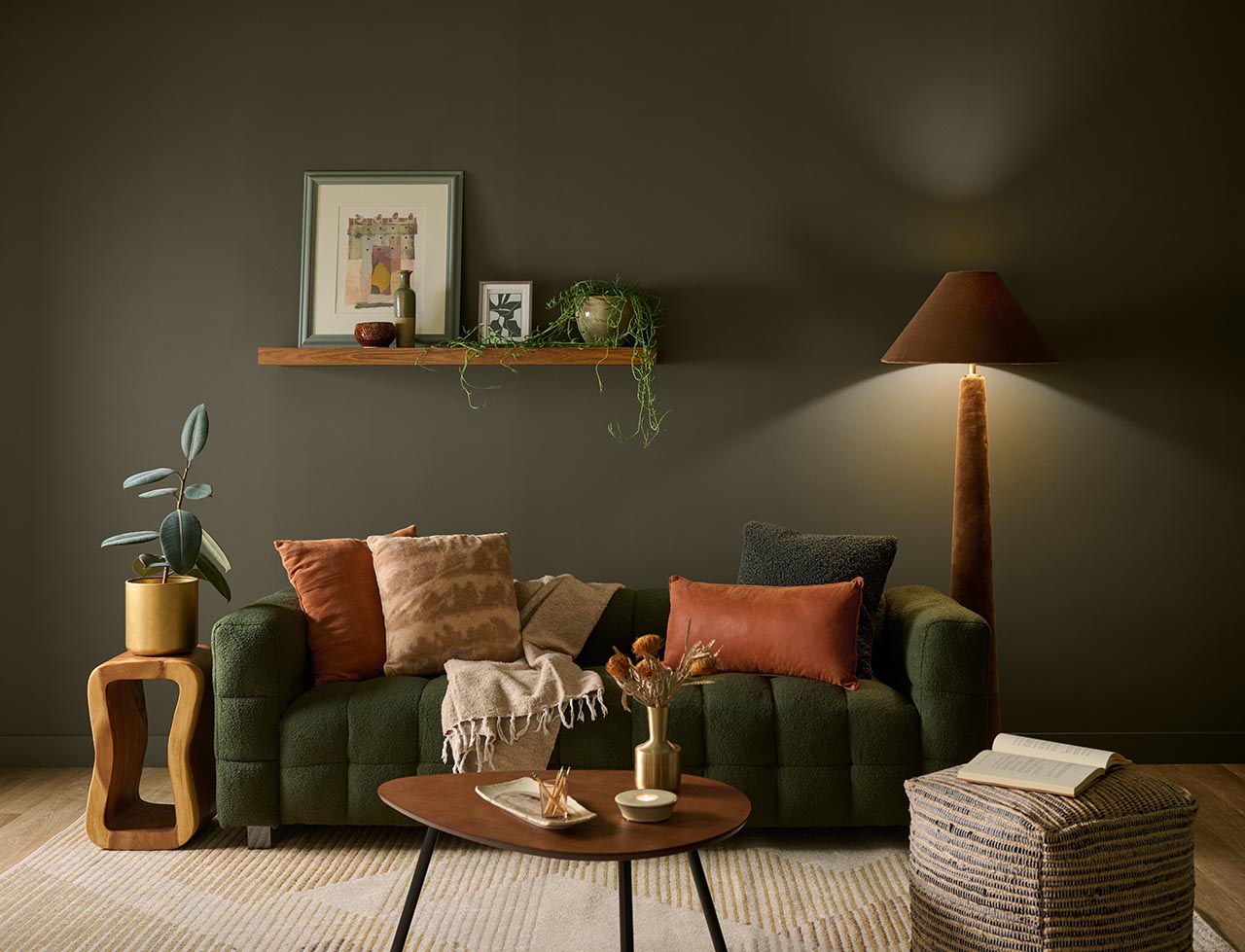
One of the first to debut its selection for color of the year, Behr Paint Co. chose Grounded, an organic, dimensional shade of green between olive and moss. “Grounded is a reminder that the most meaningful spaces are the ones that help us connect with the rhythms of everyday life,” says Kayla Kratz, head of color at Behr. “The shade’s organic warmth creates a sense of calm and renewal, making every room feel inviting and effortlessly livable.”
Grounded is part of Behr’s 2027 Color Trends Palette, which includes these complementary shades:
- Coastal Beige: a light neutral with yellow undertones
- Wheat Grass: a muted yellow-green
- Environmental: a soft, warm green
- Denim Light: a light blue with a soft gray undertone
- Smokey Claret: an earthy plum
- Sarsaparilla: a brown-cast plum
- Mozart: a rich lapis blue
The colors are meant to work seamlessly together, allowing homeowners and industry professionals to craft spaces that connect beautifully.
This year also marks the 10th anniversary of Behr’s Color of the Year program, which was commemorated by a $250,000 donation to Habitat for Humanity to support affordable homeownership programs.
Dutch Boy Paints: Deep Rooted

Dutch Boy Paints
Dutch Boy Paints—which has a major retail partnership with Menards, a home improvement retailer with locations throughout the Midwest—selected Deep Rooted as its 2027 color of the year, an earthy orange that brings interiors to life. “Our 2027 color of the year feels alive with personality while being rooted in the familiar warmth of nature” says Lisbeth Parada, color marketing manager at Dutch Boy Paints. “Deep Rooted offers a color that feels rich, grounding, and deeply human. Its earthy orange tone creates a versatile foundation for spaces that celebrate individuality through bold contrasts and layered textures.”
Dutch Boy Paints chose Deep Rooted after completing a trend-forecasting process using design research, market insights, and cultural analysis, landing on a shade that reflects the mood of the present as well as the enduring appeal of colors that embrace authenticity and emotional clarity. In addition to its color of the year, Dutch Boys unveiled its full 2027 Color Trends Forecast, which features three curated palettes showcasing Deep Rooted’s versatility:
- Essence: Intended for spaces anchored in intentional living and connection, features Deep Rooted (311-7DB); Antique White (011W), a soft neutral; and Western Orange (209-4DB), a warm orange.
- Bliss: Designed to evoke joy and play in everyday spaces, includes Deep Rooted (311-7DB); Champagne Fizzle (304-1DB), a soft blush tone; and Ribbon Blue (237-7DB), a bold blue for added contrast.
- Clarity: Reflects a desire to slow down in spaces designed to feel focused and comfortable, features Deep Rooted (311-7DB); Felted Blue (430-5DB), a muted blue-gray; and Timbered Green (232-6DB), a deep green.
Compare trends by exploring The 2026 Color of the Year Announcements
|
|
|